Client: Aura France
Services: Brand Identity · Packaging Design · Campaign
Industry: Beauty & Skincare
The brief
Aura is a French skincare line entering a market full of loud claims and over-promising labels. It needed an identity that felt premium and trustworthy, one that lets the product speak for itself.
The idea
The name says it all: an aura is the quiet glow of healthy skin, a signal rather than a shout. We built the brand around restraint, letting confidence come through simplicity instead of bold claims.
Brand identity
- A clean, lowercase sans-serif wordmark, minimal, modern and effortlessly elegant
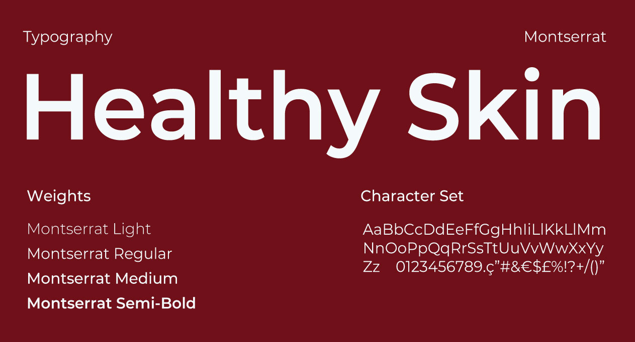
- Montserrat as the supporting typeface, for clarity and consistency across every touchpoint
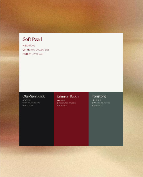
- A palette of deep crimson and obsidian, softened by an ivory-pearl tone. It positions Aura closer to fine fragrance than mass-market skincare.
Packaging
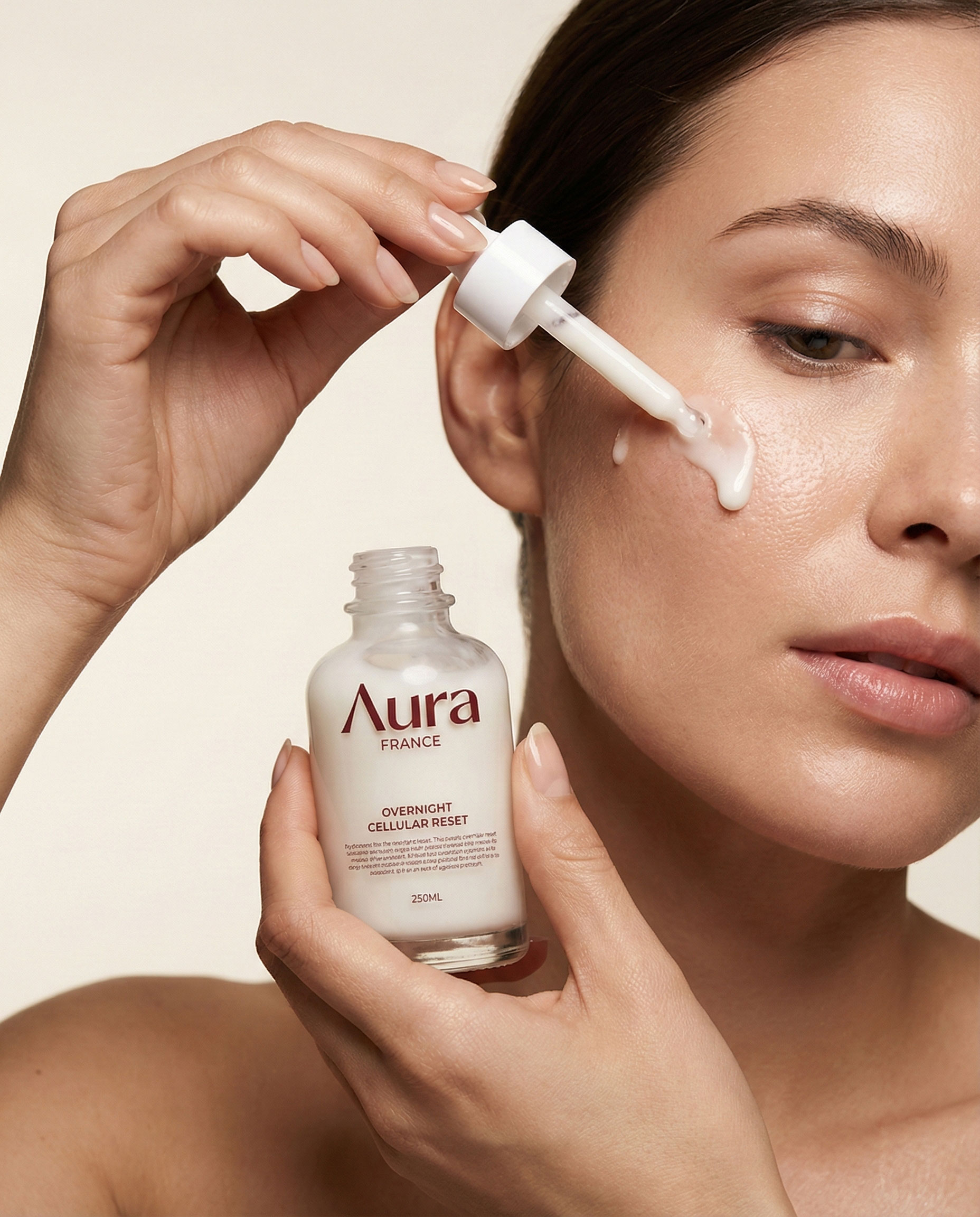
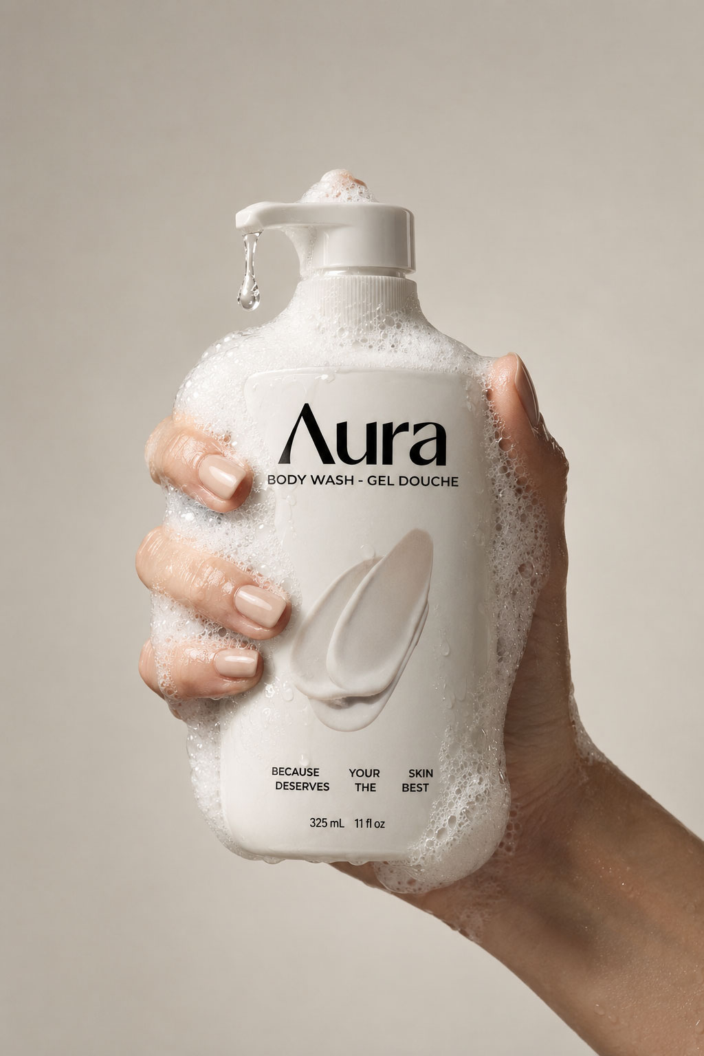
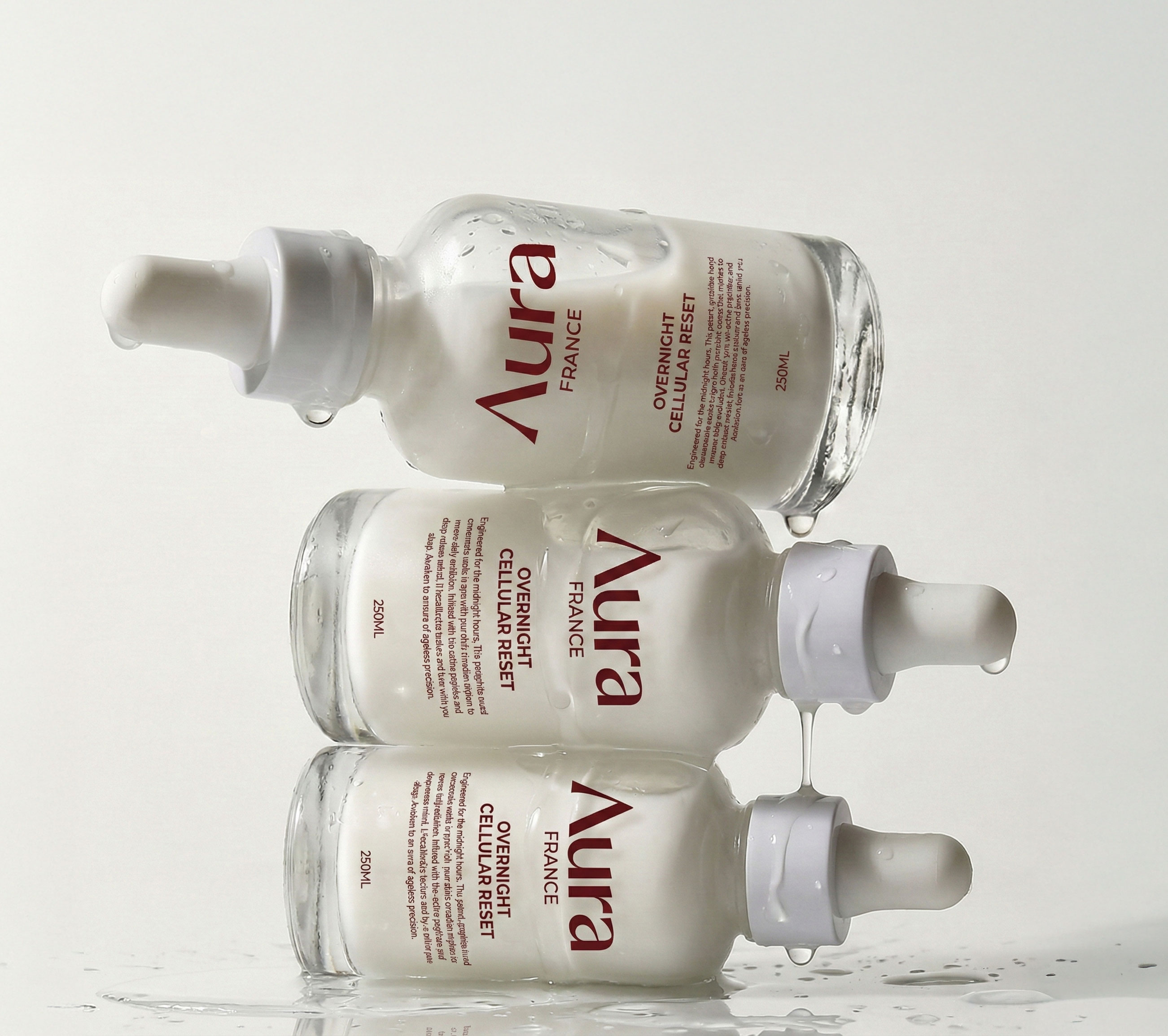
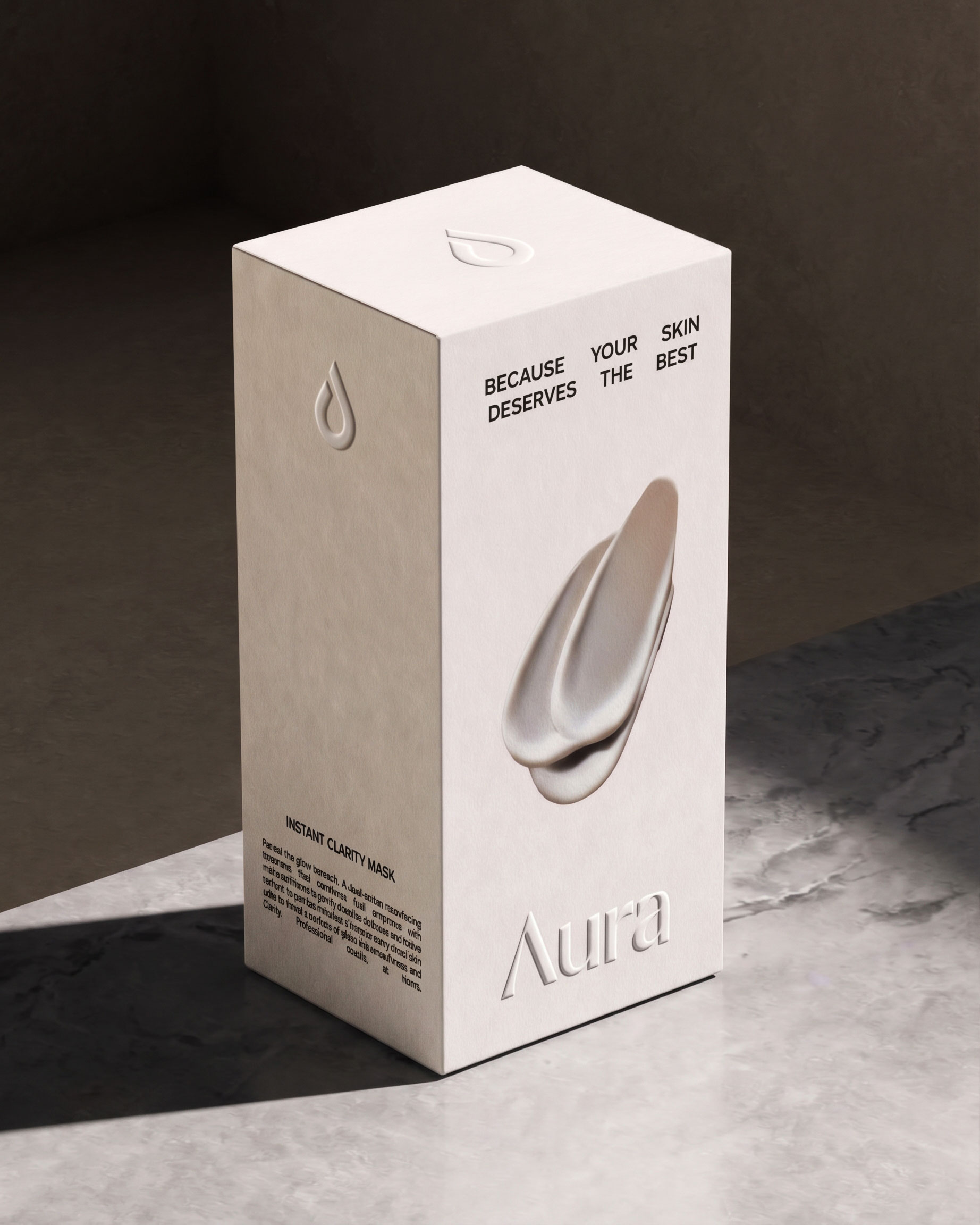
One unified system across the whole range: serums, jars, tubes and shower gel. Each product shares the same calm hierarchy and colour language, so the line feels cohesive and premium on any shelf or bathroom counter.
Campaign
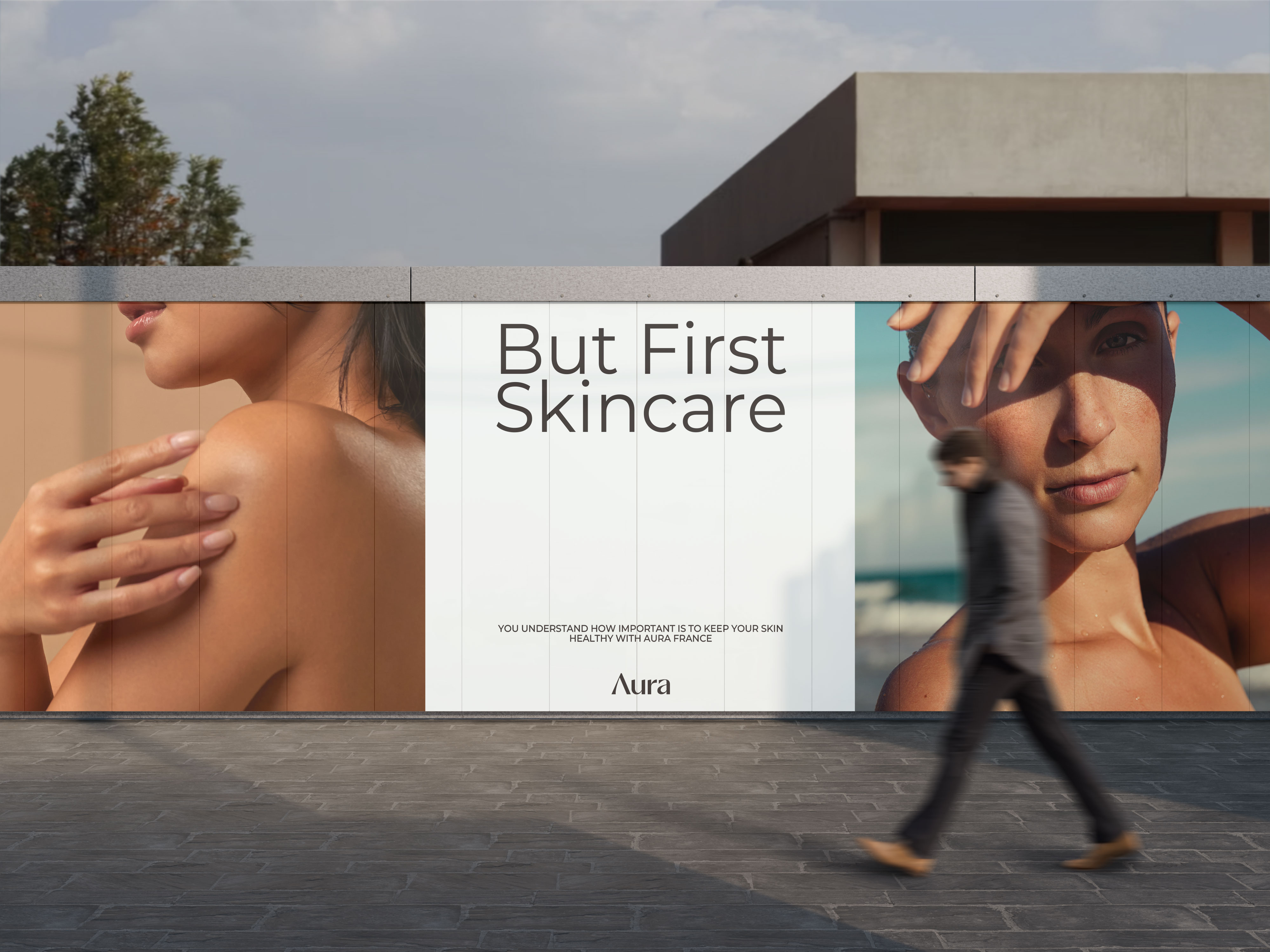
We extended the identity into the “But First, Skincare” campaign, applied to street posters and outdoor advertising. It’s a simple, confident message that brings the brand’s quiet luxury into the real world.
The result
Aura now has an identity that feels as refined as its formulas: understated, elegant and built for a brand that doesn’t need to shout to be noticed.