
Client: Buono
Services: Brand Identity · Packaging Design · Brand Applications
Industry: Food & Beverage — Gelato
The brief
Most gelato brands look the same: quiet, craft-focused and a little too serious. Buono wanted to stand out with an identity that captures how gelato actually feels to eat.
The idea
We built the brand around one moment: the instinctive, unguarded “mmm” of the first bite. Instead of whispering about tradition, Buono is loud, playful and full of joy, just like the product.
Brand identity
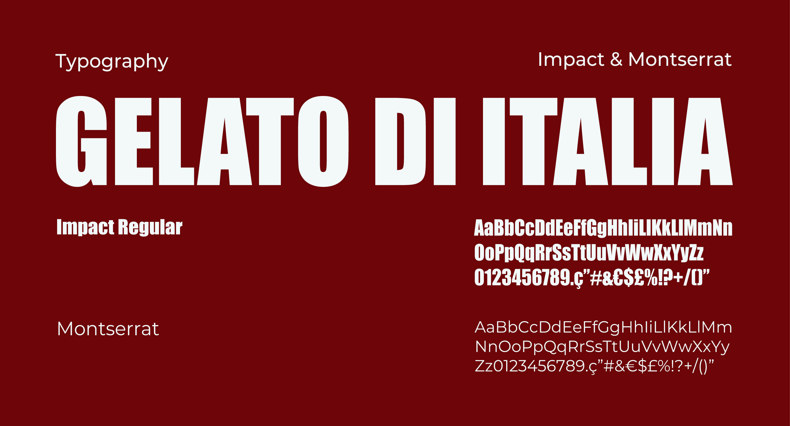
- A heavy, condensed wordmark that’s bold, confident and instantly recognisable from across the street
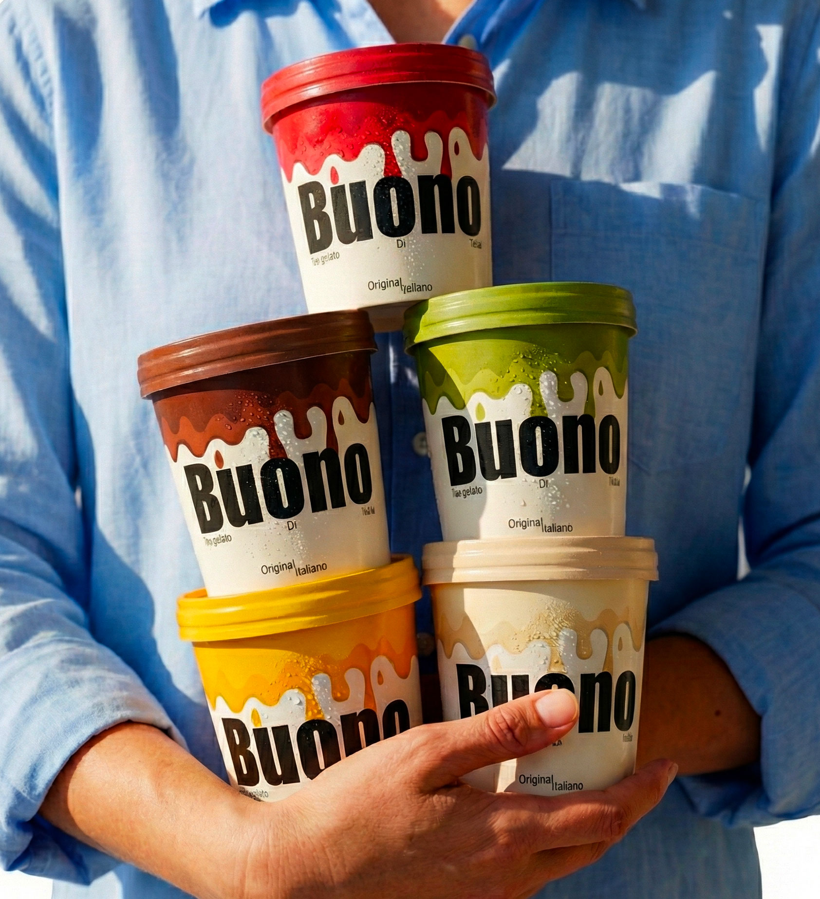
- A signature drip motif on every pint lid that doubles as a flavour-coded colour system
- A flavour-led palette that changes with each product: strawberry red, pistachio green, rich dark chocolate
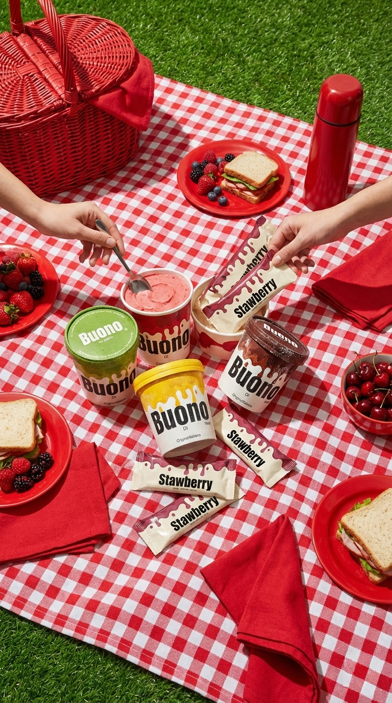
- Photography that captures people mid-bite, putting the emotion at the centre of the brand
Packaging & applications
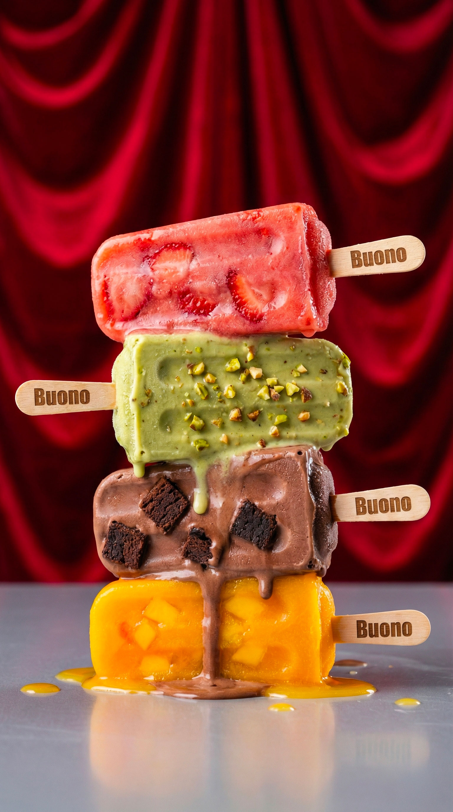
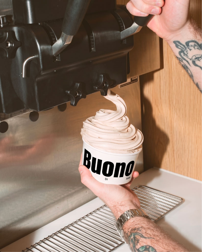
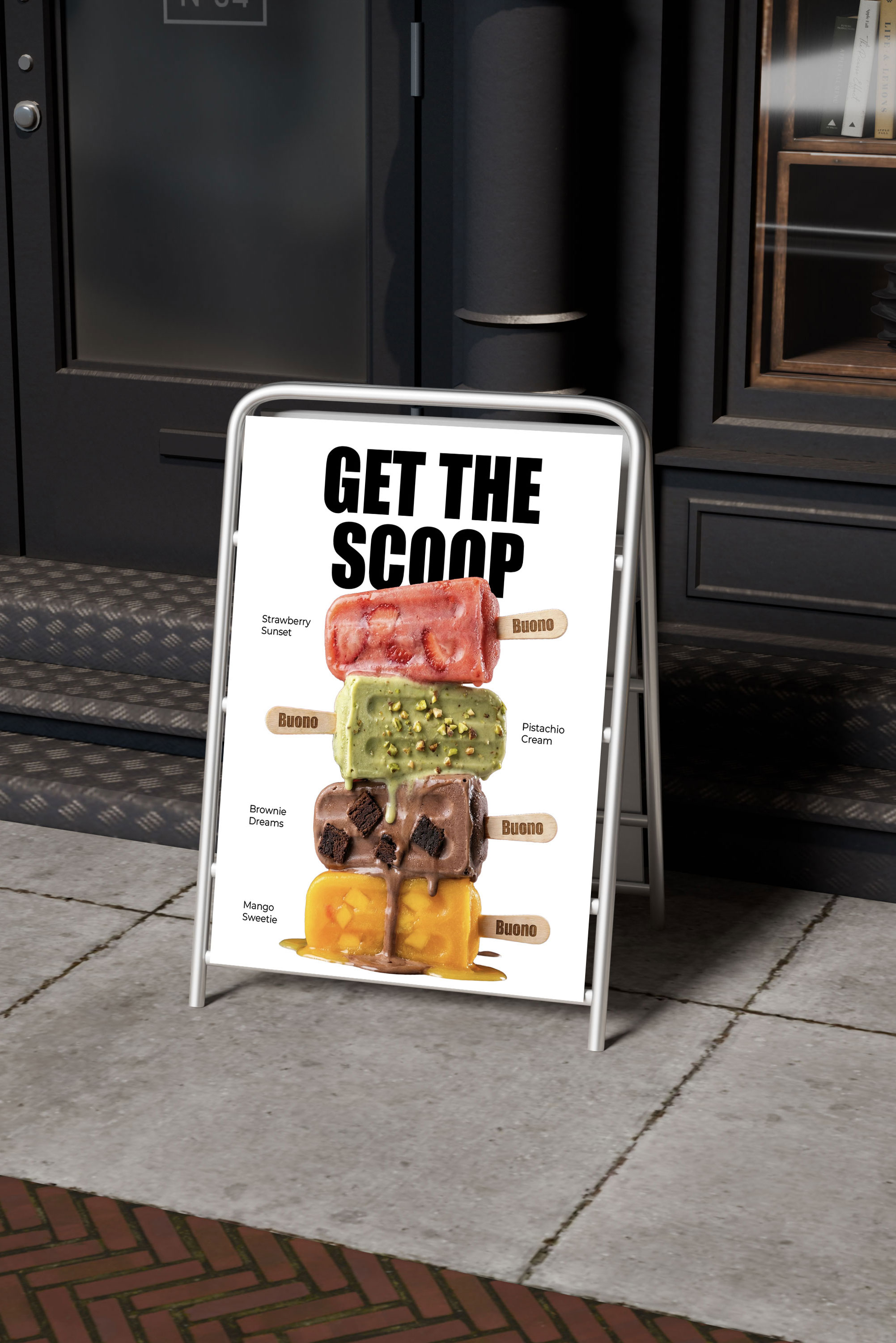
The system works across the whole range: pints, gelato pops on wooden sticks and soft-serve cups. Each product is clearly part of the same family, and every flavour still has its own personality. The identity carries through to in-store signage, menu boards and the soft-serve machine, creating a consistent experience from shelf to counter.
The result
Buono now has a brand that’s as irresistible as its gelato: bold on the shelf, fun in the hand and memorable long after the last bite.