
Client: Lumi Skin Care
Services: Brand Identity · Packaging Design
Industry: Skincare & Beauty
The brief
Lumi set out to make daily skincare feel like a breath of fresh air, swapping clinical routines for something vibrant, joyful, and effective. The range covers hydration, firming, and overnight renewal. Lumi needed a brand identity, with a heavy emphasis on a standout packaging system, that feels as radiant as the results it delivers, appealing to consumers looking for approachable, high-quality skincare that pops on the shelf.
Brand identity
We built the identity around the idea of vibrant, effortless radiance. The Lumi wordmark is clean and modern, designed to run vertically down the primary packaging for a confident, graphic edge. This is anchored by a distinctive, playful monogram mark that acts as a bold sign-off in a striking orange.
The color palette entirely rejects the standard minimalist skincare tropes, leaning instead into energetic, sunny hues. Each formulation has its own distinct character, carried through its dedicated color system:
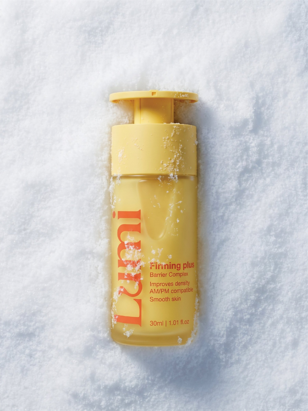
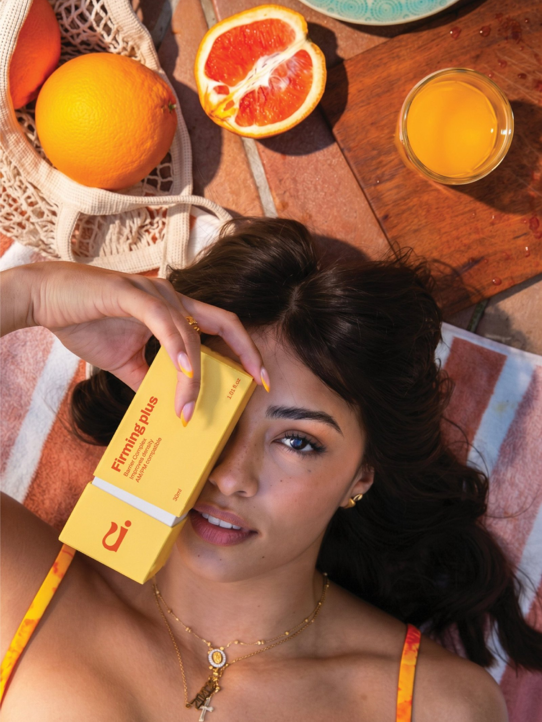
- Firming plus barrier complex serum, dressed in a cheerful, bright yellow
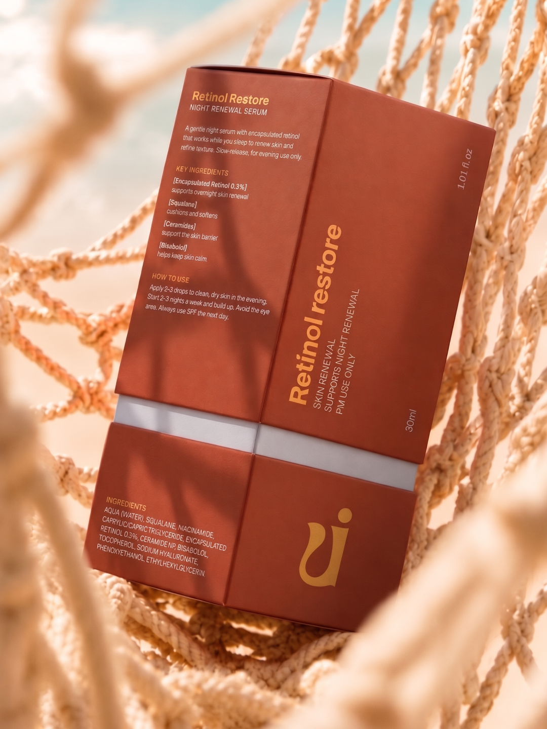
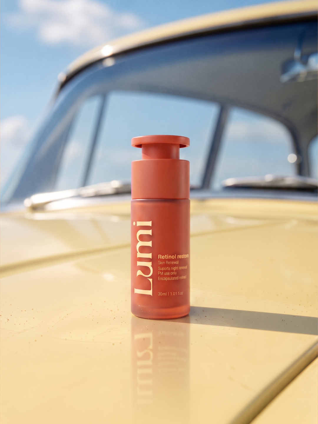
- Retinol restore night renewal serum, housed in a warm terracotta red
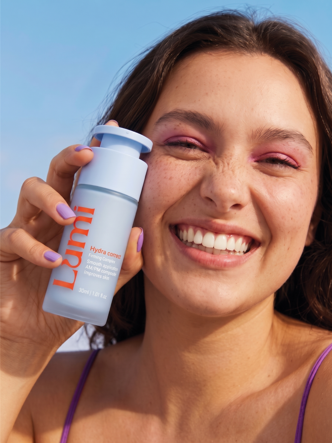
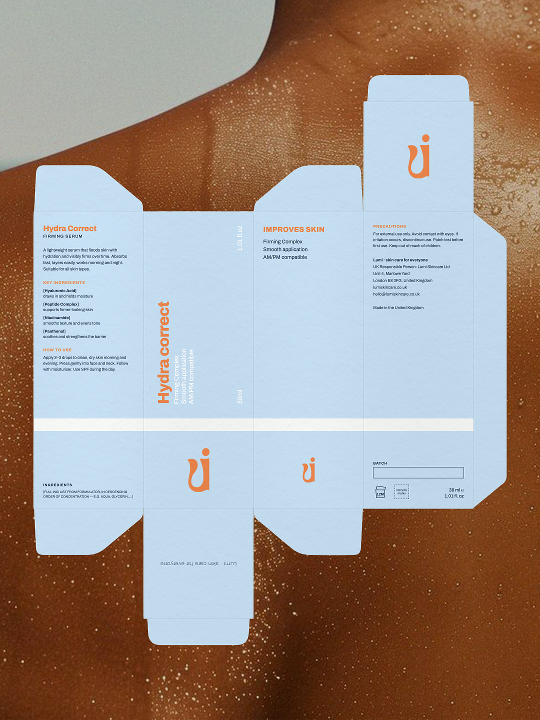
- Hydra correct rming and hydrating serum, in a soft, fresh sky blue
Packaging
As the core focus of the project, the packaging was designed to be highly tactile, functional, and undeniably photogenic. The primary bottles feature a sleek, frosted matte finish with matching pump caps, letting the bold vertical wordmark take center stage.
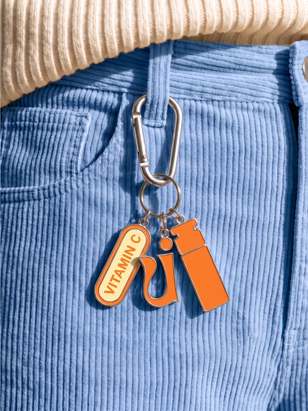
For the secondary packaging, we designed a minimal yet striking carton system. The boxes utilize a sharp color-blocking effect, pairing the product's signature color with clean white side panels and the brand's orange monogram. The typographic hierarchy is strictly organized, making it easy for users to find key active ingredientslike Encapsulated Retinol, Squalane, and Ceramidesalongside clear "how to use" instructions. The playful brand energy even extends to lifestyle touchpoints, like custom enamel keychains featuring the monogram and a "VITAMIN C" pill tag.
Art DirectionTo showcase the new packaging system, the art direction stepped out of the sterile studio and into the sun. We captured the products in vivid, unexpected lifestyle environments: nestled in fresh snow, resting on the hood of a vintage yellow car, sitting in a woven hammock, and paired with freshly sliced citrus on a beach towel. Playful, human-centric props—like a stack of colorful beach floats—reinforce the brand's lighthearted, summery personality.
The resultLumi now has a striking, cohesive packaging and identity system that feels as refreshing as the formulas inside. By balancing clear, educational packaging layouts with highly energetic colors and lifestyle-driven art direction, the brand easily cuts through the noise of a crowded skincare market.