
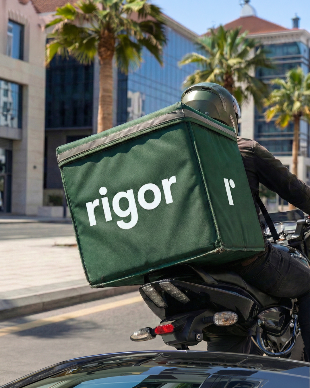
For the launch of wellness brand Rigor, Ondas Studio developed a complete brand identity and strategic positioning designed to redefine the ready-meal category. Addressing a market traditionally torn between fast convenience and genuine nutritional integrity, the project reframes pre-prepared food as an uncompromised, health-first choice.
Before establishing the visual language, the studio focused on the overarching brand strategy. The name Rigor served as the foundational anchor, signaling exactness, nutritional discipline, and complete transparency in sourcing and preparation. Rather than framing convenience as a shortcut, the strategic model positions it as an act of precision, doing the deliberate, calorie-conscious, and macro-balanced work on behalf of the consumer.
The strategic foundation balances this scientific exactness with approachable warmth. Everyday ready-to-eat meals, from nutrient-dense grain bowls to clean, portion-controlled proteins, are presented not as clinical fuel, but as a seamlessly integrated lifestyle ritual. The brand speaks to the reality of modern routines, bridging the gap between high-performance nutrition and daily ease.
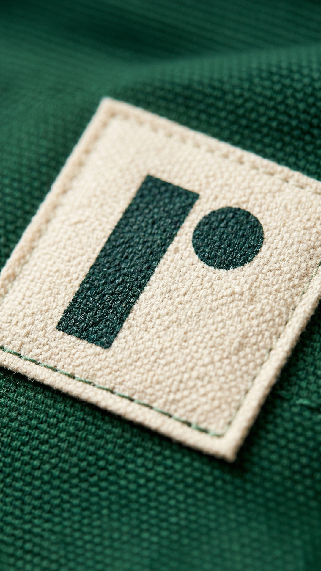
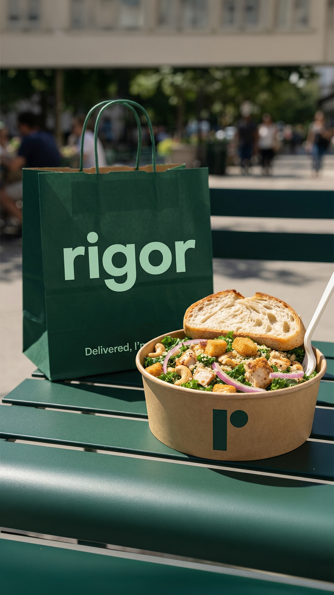
Combining clean typographic hierarchy with tactile organic elements, the visual identity reflects this core duality. A clear, confident logotype delivers immediate trust and transparency, paired with a distinct graphic mark inspired by the avocado, a universal symbol of whole, fresh produce. Natural textures and grounded color tones soften the systematic typography, establishing a harmony between disciplined routine and real food.
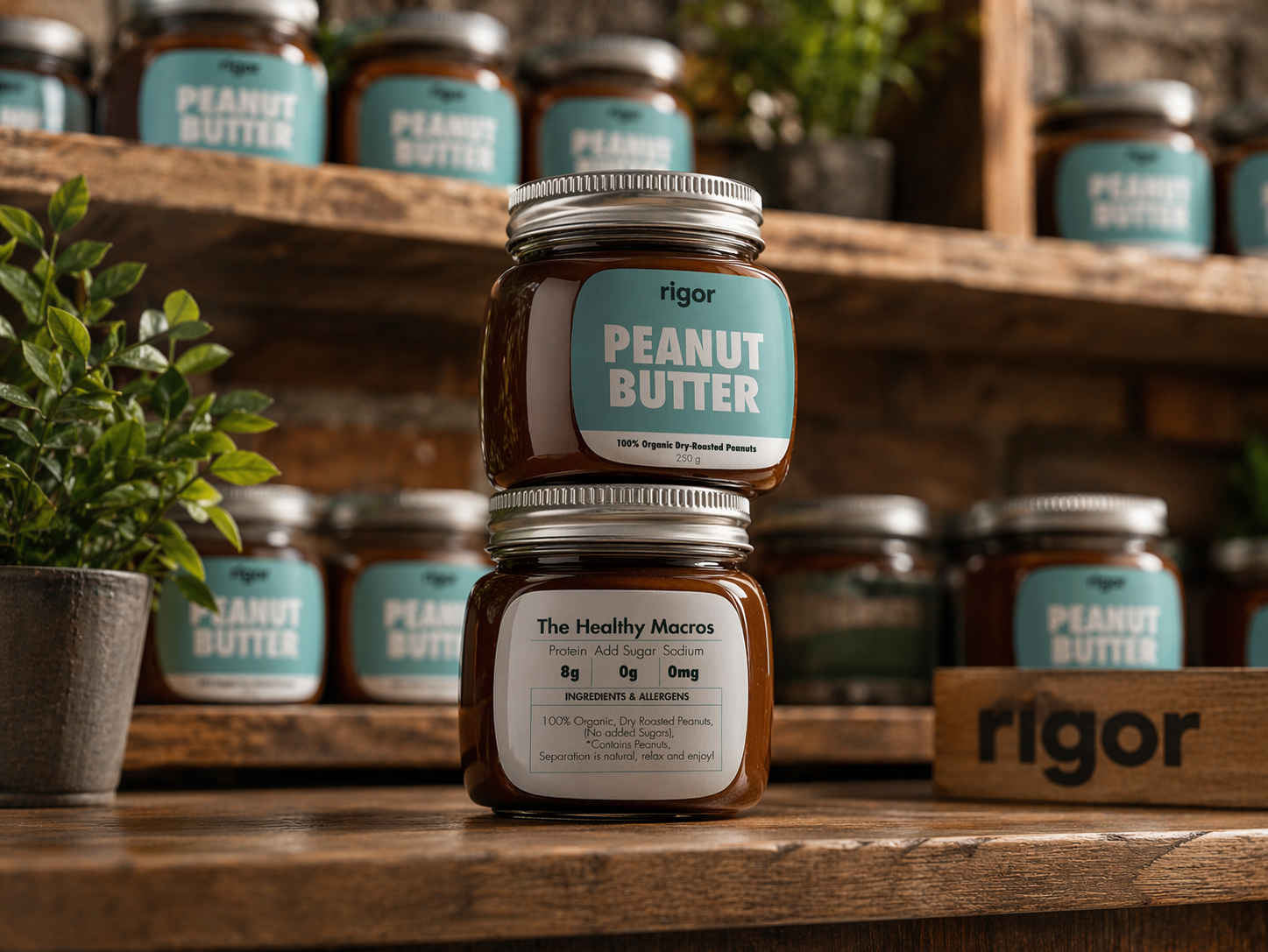
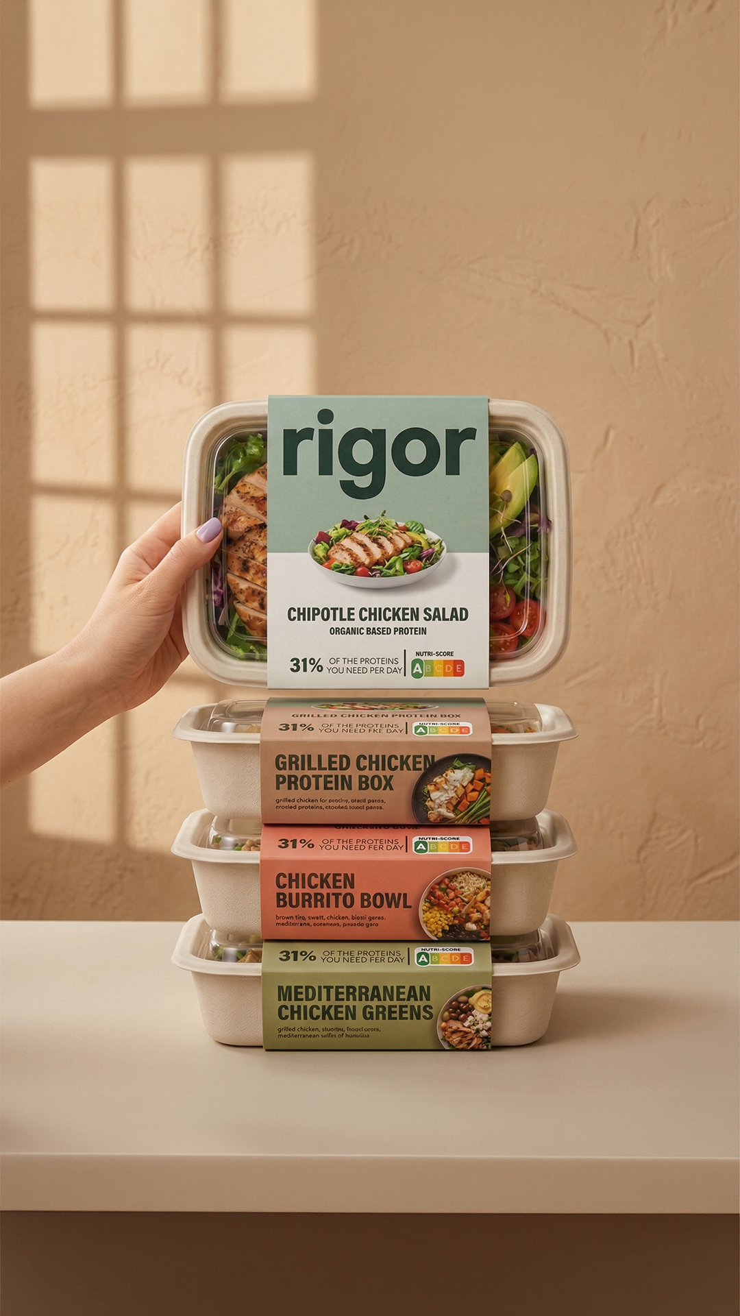
The design system scales effortlessly across physical and digital touchpoints. Packaging utilizes a structured layout that prioritizes nutritional clarity and macro breakdowns without cluttering the visual field. The minimalist treatment allows the rich, natural colors of the food itself to take center stage, sitting cleanly on retail shelves, office desks, and in meal-prep kits.
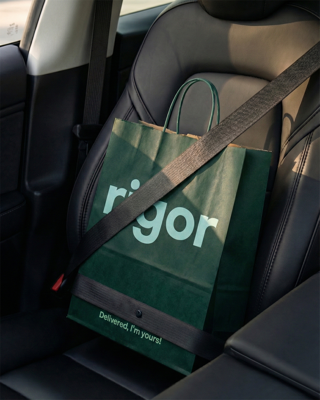
Seen from a distance on city billboards or window graphics, the brand functions as an architectural, confident lifestyle statement. On closer inspection, packaging and digital touchpoints reveal meticulous layers of information—dietary breakdowns, ingredient sourcing, and precise nutritional data—that validate the brand’s core promise.
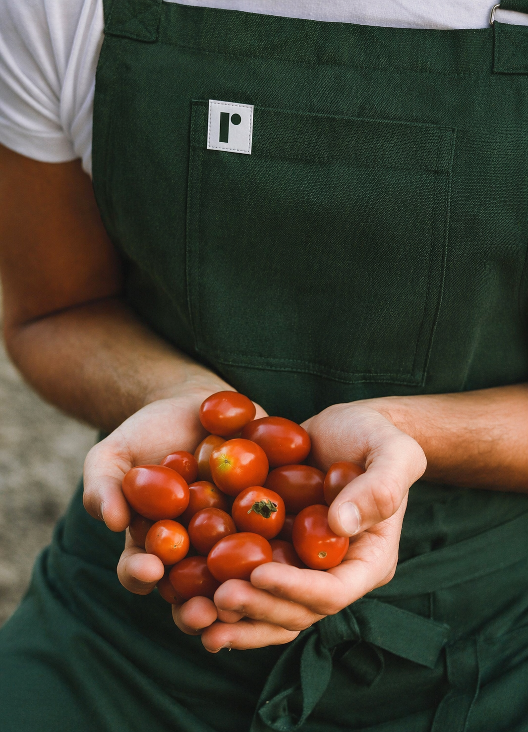
To extend the identity beyond the meal itself, Ondas Studio created a cohesive suite of branded collateral, including insulated flasks, lunch containers, outdoor advertising, and custom aprons for staff, embedding the identity into every corner of the customer experience.
The project marks the beginning of an ongoing design partnership with Rigor, encompassing brand identity, packaging, environmental graphics, and digital communication. By establishing a clear strategy prior to visual execution, the design makes a direct connection between the discipline of good nutrition and the convenience of modern living.