
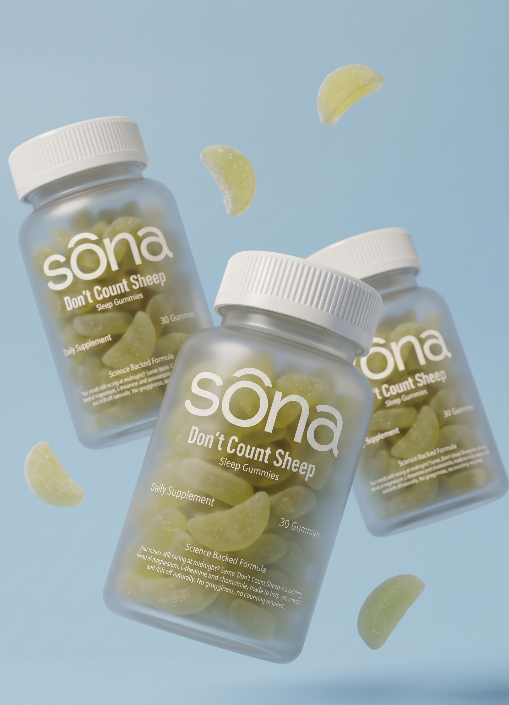

Client: Sōna Health Supplements
Services: Brand Identity · Packaging Design · E-commerce Website Design · Art Direction
Industry: Wellness & Supplements
The brief
Sōna set out to make daily supplements feel like something you look forward to, not another chore on your list. Its range covers sleep, calm, focus and energy, in gummies and capsules backed by science. Sōna needed a brand and a website to match: approachable enough for everyday use, credible enough to trust, and memorable enough to stand out in a crowded wellness market.
Brand identity
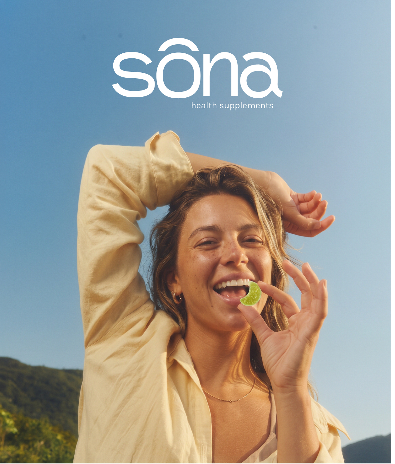
We built the identity around one idea: balance should feel good. The sōna wordmark is soft and rounded, with a distinctive circumflex accent that reads like a calm horizon. A confident condensed display typeface does the opposite job: it brings energy and personality to headlines like “Everyday Balance.”
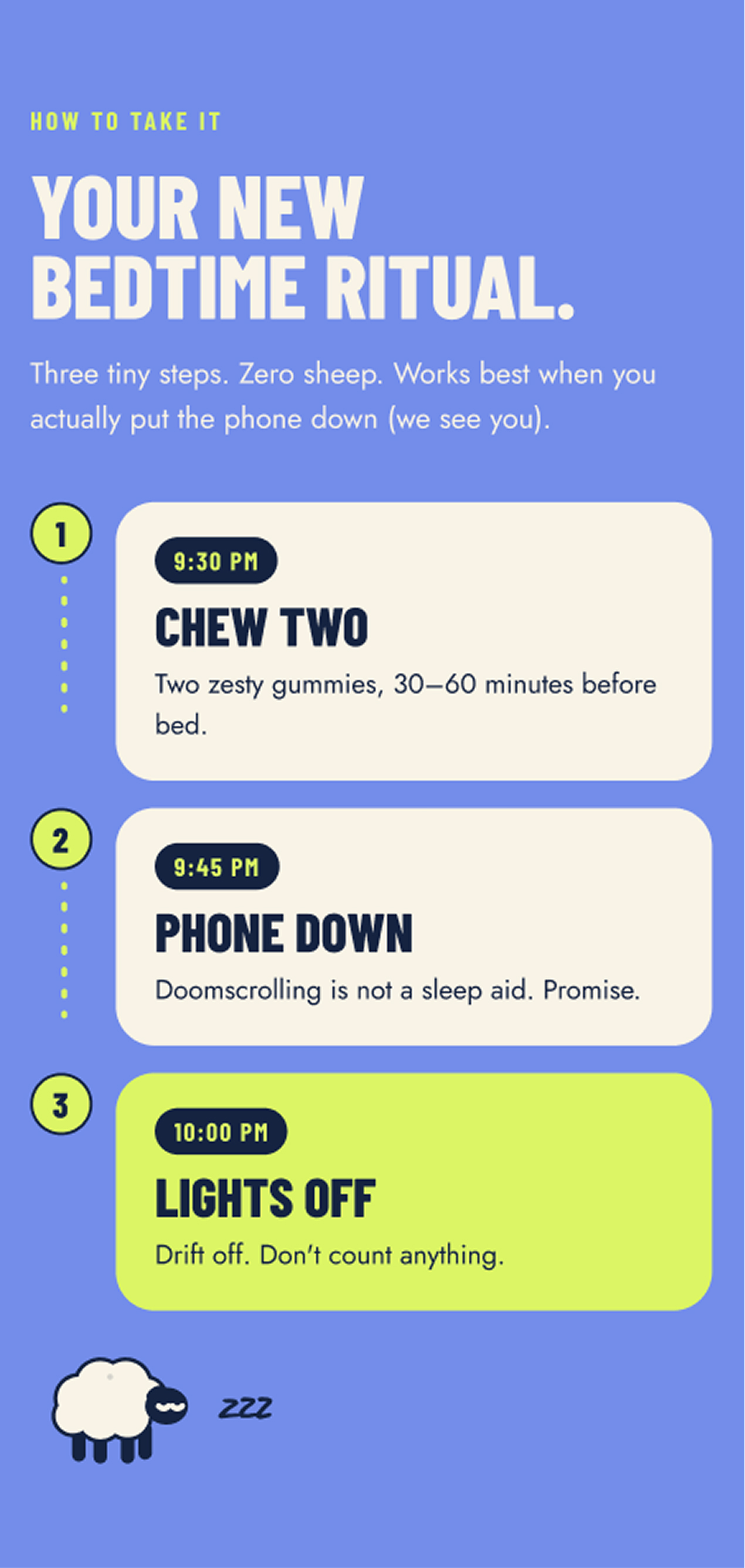
The colour palette pairs deep navy with a fresh chartreuse, set on warm cream and soft sky blue. The result feels calm and grounded but never sleepy. Each product has its own character, carried through its name, colour and gummy shape:
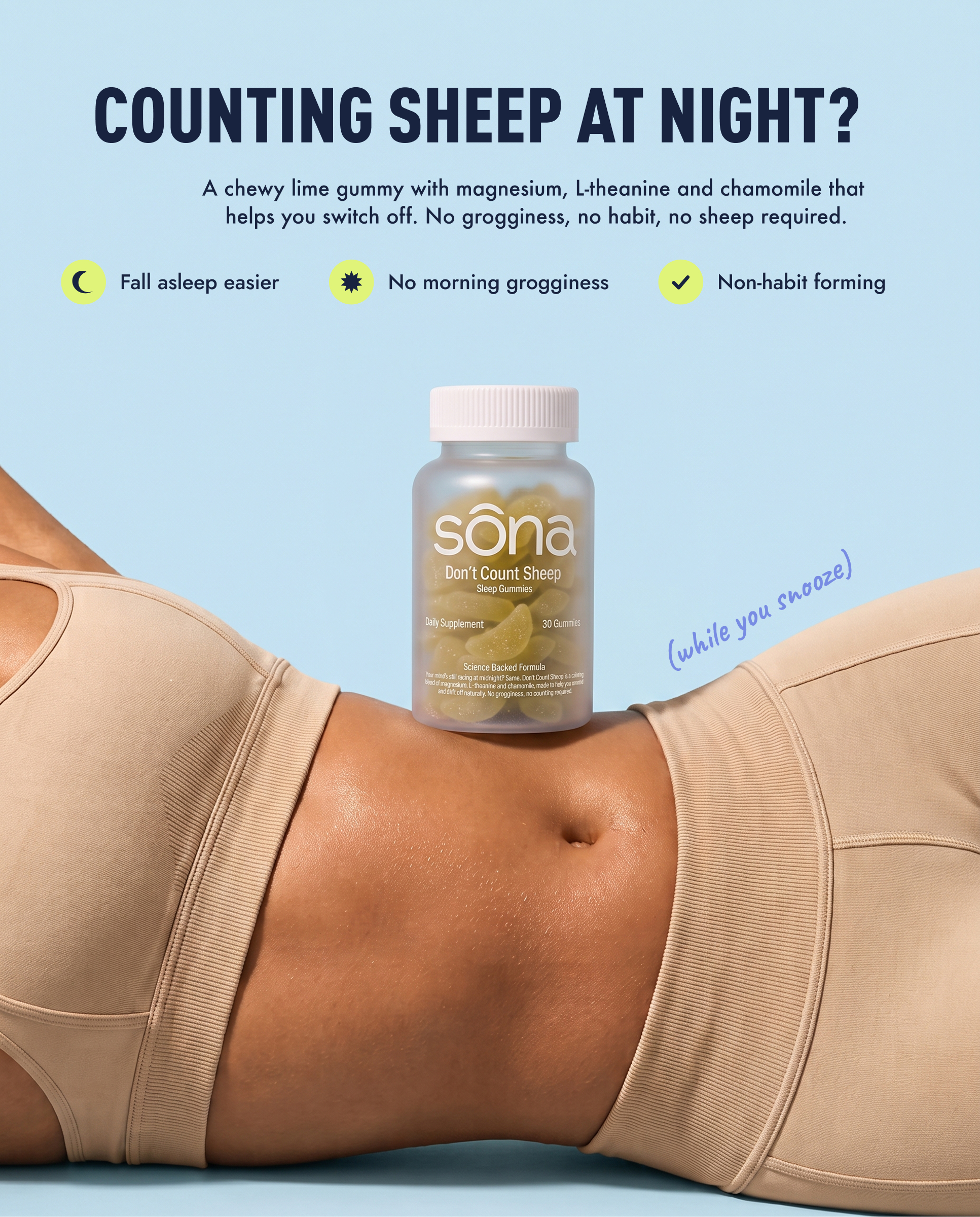
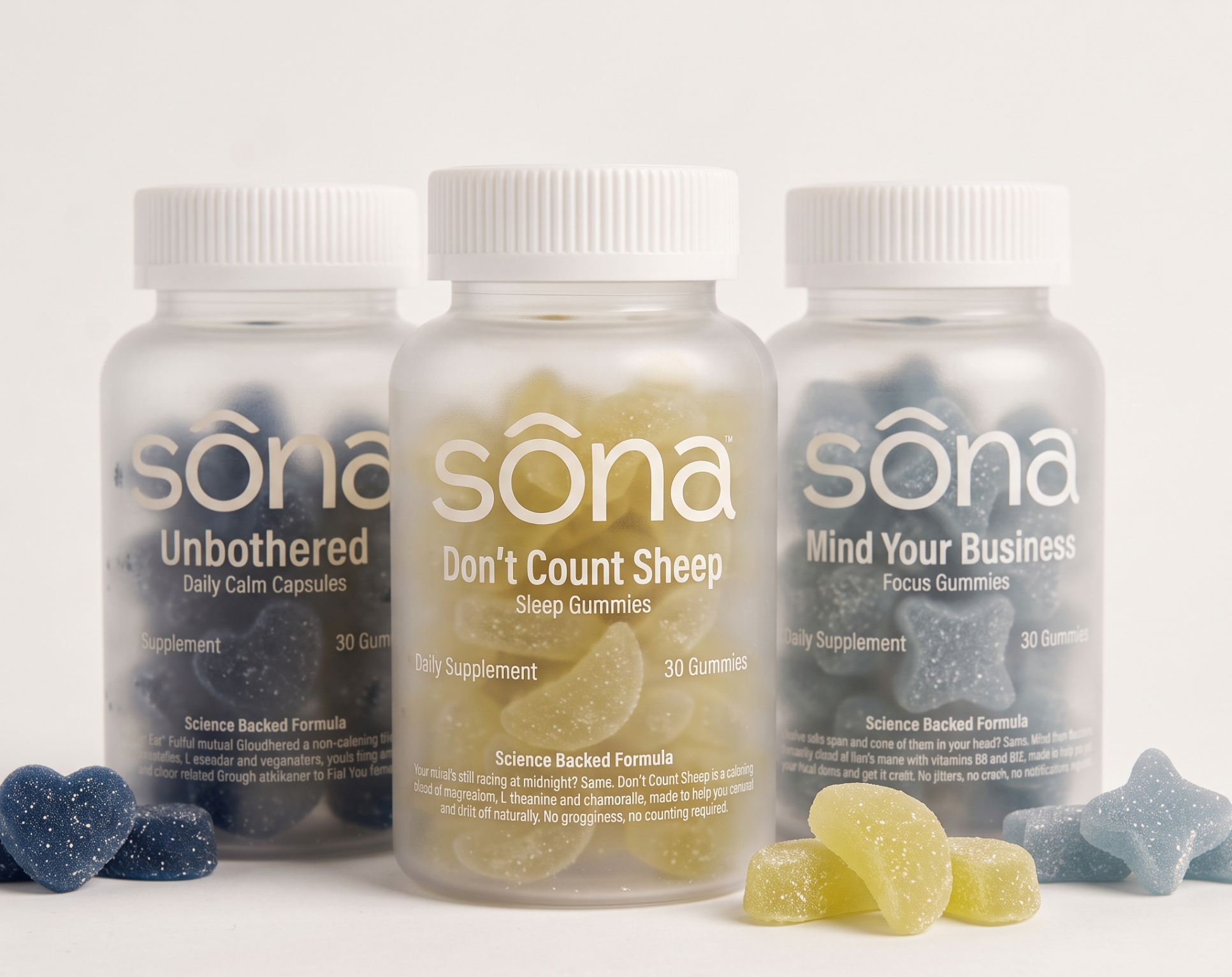
- Don’t Count Sheep — sleep gummies, in soft lemon slices
- Unbothered — daily calm capsules, in deep blue hearts
- Mind Your Business — focus gummies, in light blue stars
The names have a playful, slightly cheeky tone. That tone makes the brand feel human and gives every product a reason to be remembered.
Packaging
The frosted bottles let the colourful gummies show through. A clean, minimal label system keeps the wordmark front and centre, with clear hierarchy for the product name, function and dosage. On a shelf or in a feed, the range reads as one family, and each product is still easy to tell apart.
E-commerce website
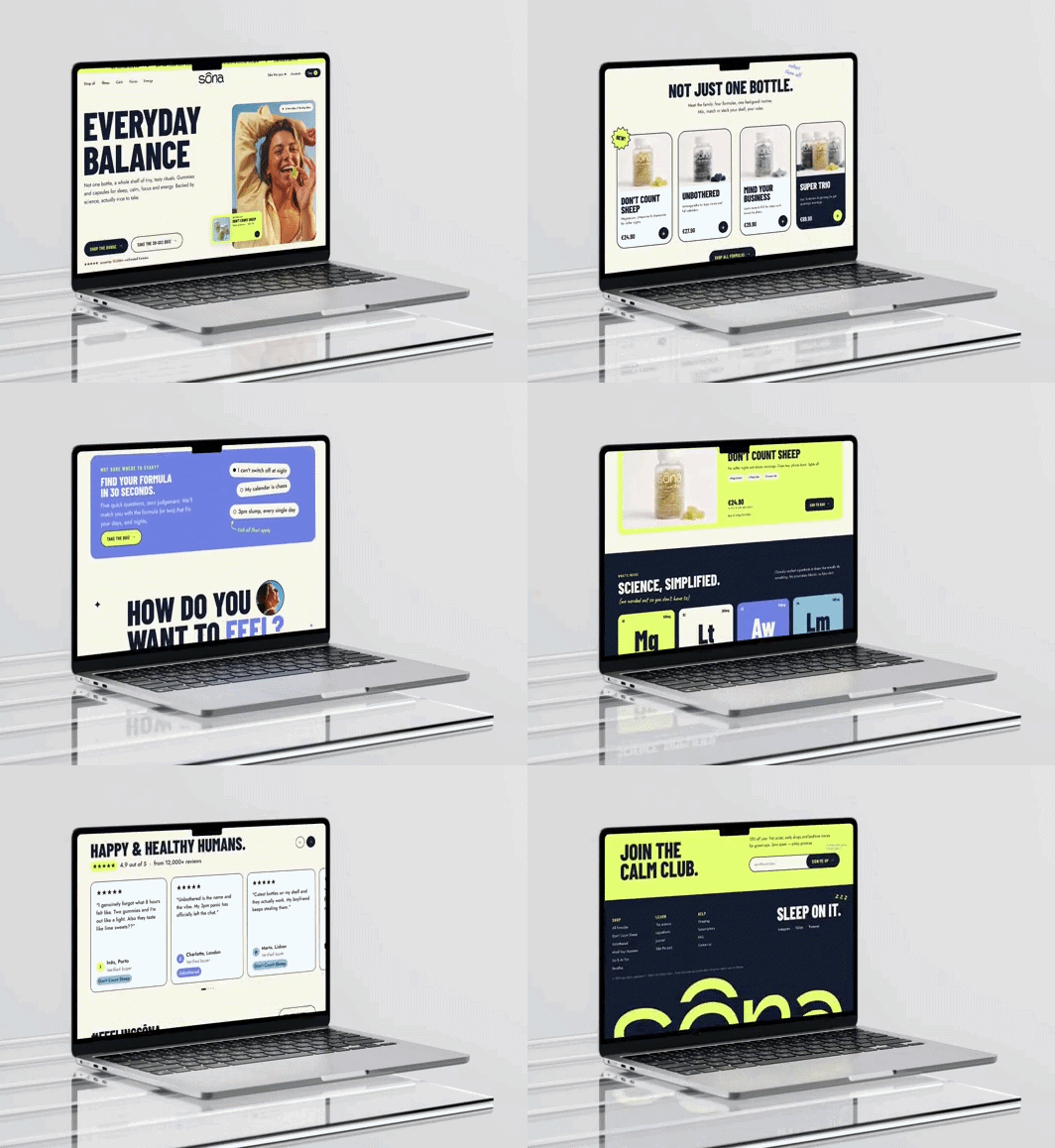
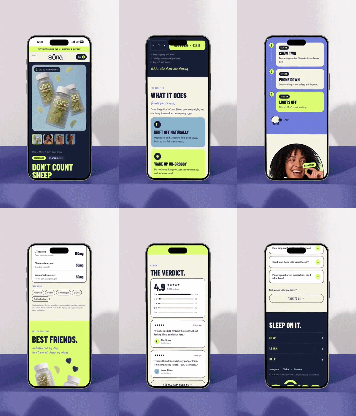
The Sōna website is designed to turn curiosity into a first purchase. The homepage opens with bold typography and sunny lifestyle imagery. A scrolling announcement bar highlights free shipping, new launches and subscription savings.
Key features include:
- Shop by need: navigation organised around Sleep, Calm, Focus and Energy, so customers find what they need in one click
- A 30-second product quiz that guides new visitors to the right formula and lowers the barrier to buying
- Featured product cards and bestsellers placed right in the hero, putting products within reach from the first scroll
- Subscribe & save, built in to encourage repeat orders and long-term customers
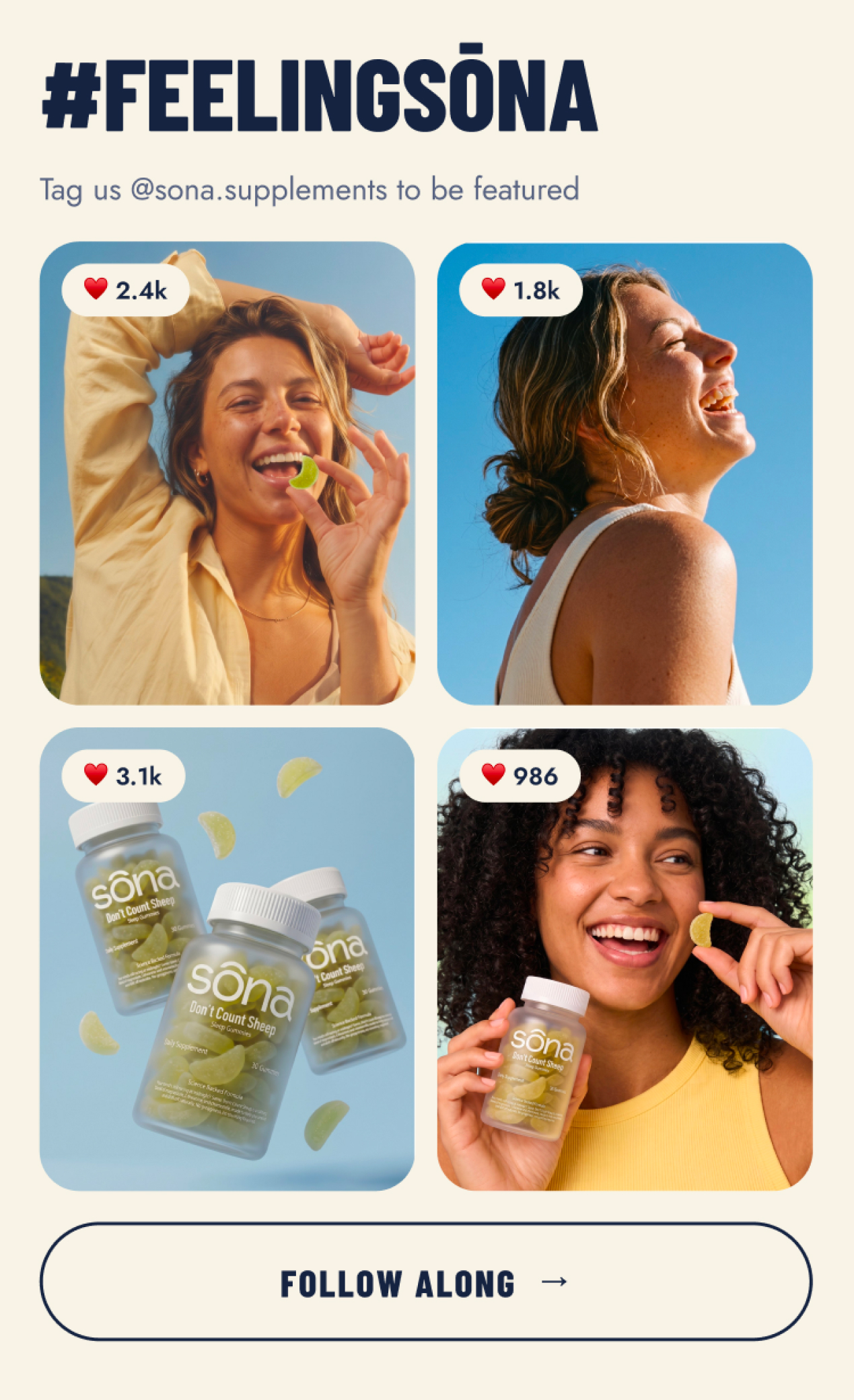
- Social proof woven through the page to build trust
- A fully responsive design for a shopping experience that feels just as good on mobile
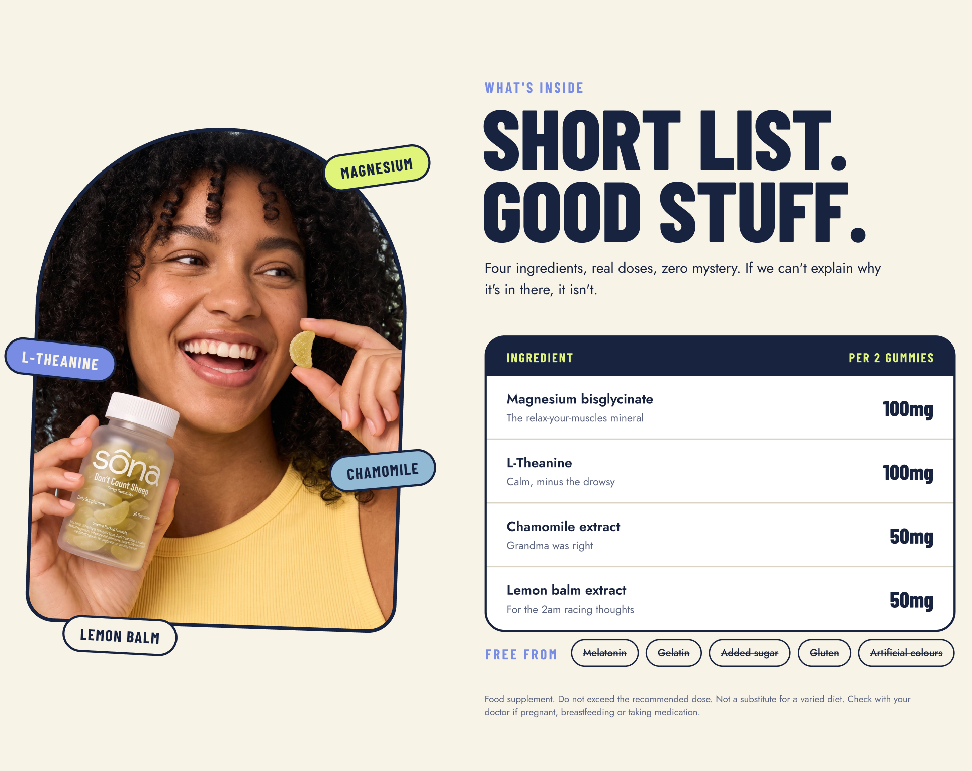
Every page balances clarity and personality: generous white space, clear calls to action, and photography that shows real moments rather than clinical product shots.
The result
Sōna now has a cohesive brand system across packaging, photography and digital. The website feels as good to browse as the products feel to take, and it’s built to convert first-time visitors into loyal, well-rested customers.